
User Experience (UX) plays a critical role in the success of ecommerce websites. This is because when it comes to web design, striking the right balance between aesthetics and usability is crucial, especially for text-heavy pages. Whether it's a product description, blog article, a news article, or an informational resource, effectively presenting large amounts of text to users can be a challenge.
However, with the implementation of user experience (UX) best practices, you can ensure that your text-heavy pages are not only visually appealing but also user-friendly and engaging. In this blog, we'll explore some of the top UX practices, according to our experts, for text-heavy pages that will enhance readability, improve user engagement, and keep visitors coming back to your ecommerce website for more.
So let’s get stuck in!
Prioritise readability
The readability of text-heavy pages is paramount to keeping consumers engaged. UX directly influences customer satisfaction. By providing a seamless, intuitive, and enjoyable user experience, ecommerce websites can create positive interactions with customers. When users can easily navigate, find products, and complete purchases without frustration, they are more likely to have a positive perception of the brand and become loyal customers. Here are a few key practices to improve readability and keep those customers coming back time and time again:
Use clear typography: Select legible fonts and font sizes, ensuring sufficient contrast between text and background. Sans-serif fonts are often preferred for on-screen readability.
Break up content with Headings: Organise your text into logical sections using headings and subheadings. This not only improves readability but also allows users to scan and navigate through the content more easily.
Use ample whitespace: Avoid overwhelming users with walls of text. Incorporate sufficient whitespace between paragraphs, lines, and elements to give the eyes a visual break and make reading less daunting.
Implement effective information hierarchy
A well-structured information hierarchy helps users navigate through text-heavy pages and find the information they need more efficiently. Whether it be product descriptions, delivery rates or return policies, consider the following practices:
Use clear and concise introductions: Start each description, section or paragraph with a concise introduction that provides a clear overview of the content to follow. This helps users quickly determine whether the information is relevant to their purchasing needs.
Employ bulleted or numbered lists: Lists help break down complex information into digestible chunks, making it easier for users to comprehend and retain key points.
Highlight key takeaways: Use formatting techniques like bold, italics, or different colours to emphasise important information or key takeaways. This allows users to quickly identify crucial points within the text.

In just a short turnaround of 6 months, we delivered a full rebrand consisting of Art Direction and Concepts, UX and Wireframes and Responsive Mobile-First Page Designs for LSA. The final result is a stunning website with a new and improved look and user experience! Read the full case study to find out more.
Enhance navigation and search capabilities
Efficient navigation and search functionality are essential for users to find specific information within text-heavy pages. With the rise of mobile commerce, having a mobile-friendly UX is particularly important for ecommerce success. Mobile optimisation ensures that users can easily browse, shop, and make purchases from their smartphones or tablets. Responsive design, fast-loading pages, and intuitive mobile navigation are essential to provide a positive mobile experience and capture the growing market of mobile shoppers. Here are some things to consider to enhance your navigation on both desktop and mobile:
Implement a clear and visible menu: For long-form content, provide a table of contents at the beginning of the page, allowing users to jump to specific sections without scrolling extensively.
Incorporate in-text anchors: Within lengthy blog articles, include in-text anchors that enable users to navigate directly to specific subsections or points of interest that may relate to products.
Offer robust search functionality: Implement a clear search bar that allows users to search for keywords or topics within the text-heavy site. Ensure that search results for products are then accurate, relevant, and well-organised in line with search terms.
Include visual elements to enhance understanding
As a design agency we know visual elements can significantly enhance user engagement and comprehension of text-heavy pages. In a crowded ecommerce landscape, superior UX with awesome graphics can differentiate a brand from its competitors. By offering an exceptional visuals, your websites can stand out and leave a lasting impression on customers. Here are some ways you can make your UX unique and memorable so that you can attract and retain customers in a highly competitive market:
Use relevant images and graphics: Incorporate images, banners, infographics, or diagrams that complement the text and help illustrate concepts or data. Visual aids can break the monotony of text and enhance user understanding.
Include pull quotes, reviews or callout Boxes: Pull quotes or callout boxes with important quotes or key statistics can draw attention to significant information, making it more memorable for users.
Employ multimedia content: Embed videos or audio clips that provide additional context or explanations for complex products. Multimedia elements can engage users and cater to different learning preferences. Not to mention in the fashion industry in particular can offer a different dimension to the shopping experience where customers can see how to product may look on themselves.
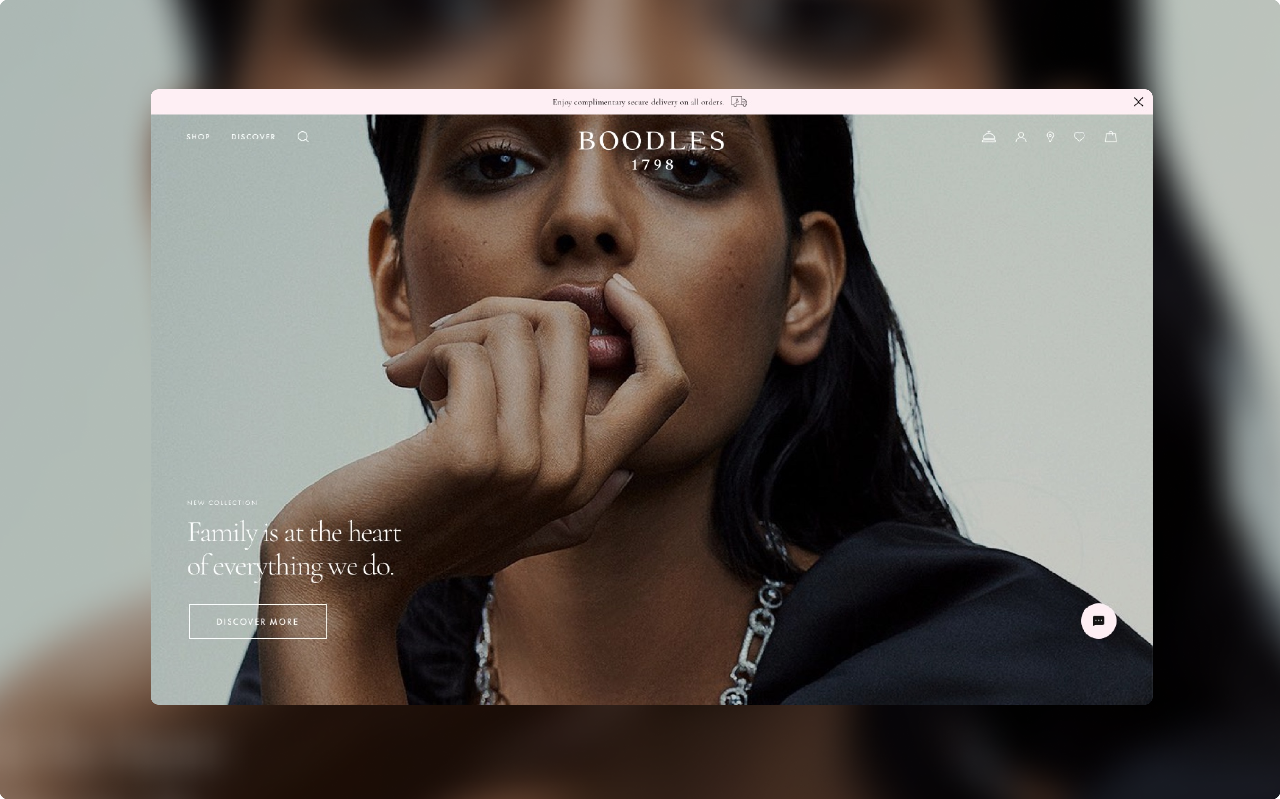
We got to work on the UX for Boodles, delivering a raft of improvements all designed to make the shopping experience easier. We started by redesigning the navigation, making it cleaner and more streamlined. We gave customers the ability to add products to their basket without going through to the full product page, brought in image carousels with product cards, built the mechanism to book in-store or virtual appointments, made the blog content much more shoppable, and introduced easy filtering. Read the full case study to find out more.
When designing text-heavy pages on your ecommerce website, applying UX best practices is crucial to ensure that users can easily navigate, comprehend, and engage with the content. UX is therefore an important consideration in the build of any ecommerce websites because it directly impacts customer satisfaction, conversion rates, trust, repeat business, differentiation, and overall competitiveness. Investing in UX design and optimisation is essential for ecommerce brands looking to create delightful experiences that drive customer engagement and maximise sales.
If you have any questions around how you could optimise the UX of your ecommerce website, or think you are in need of a digital transformation, then get in touch. Our door is always open!
We excel at looking at the broader picture, seeing where ecommerce fits in with our consultant hats on; providing the kind of strategic and creative growth that helps businesses achieve all of their goals, not just clicks.

I lead our development team on wide range of projects - from Magento 2 storefronts using Hyvä, to bespoke Shopify builds and fully custom headless applications. I’m passionate about combining clean code with thoughtful design to create seamless user experiences and scalable digital products.