iCandyMagento to Shopify migration and UX overhaul

Ecommerce strategies for parenting and baby brands are being reshaped by the expectations of a new generation of parents. Pushchair and nursery brands now face the challenge of recreating the reassurance of the in-store experience online, through rich product storytelling, mobile-first design, and seamless checkout journeys. These are not everyday purchases - they are high-value, carefully researched decisions, as parents look for products they can trust to carry their most precious cargo!
The Results
The Challenge
iCandy’s Magento 2 website had become a barrier to growth. High maintenance expenses, complex integrations, and limited flexibility made the platform difficult to manage and scale. Frequent updates slowed innovation, while international ambitions were constrained by technical limitations. For a premium brand with ambitions to expand into international markets, these challenges made it clear that a more modern, flexible, and scalable ecommerce solution was required.
Unified approach
The migration strategy focused on delivering scalability, cost-efficiency, and a complete redesign aligned with iCandy’s premium brand identity.
Migration consultancy: A TCO analysis demonstrated the long-term savings of moving to Shopify Plus
Collaborative redesign: Style guides and a brand-aligned creative direction ensured a modern, premium aesthetic
CMS transition: Shopify’s intuitive tools empowered iCandy’s team to manage and update content independently
Optimised checkout: Shop Pay, Google Pay, PayPal, and Klarna were introduced to reduce friction and boost conversions
Scalable integrations: Trustpilot and Ometria were integrated seamlessly, while inefficient legacy systems were stripped back
By combining technical migration with design innovation, we created a platform that balanced performance, usability, and flexibility.

The solution
Premium brand redesign
The new site design balances luxury and usability through modern typography, cohesive colour palettes, and fresh iconography, creating a clean and contemporary aesthetic befitting of the iCandy brand and products.
Enhanced navigation and shoppable imagery
Simplified navigation makes it easier for customers to explore products, while shoppable lifestyle and studio imagery allow users to add items to their basket directly.
Mobile-first product listing pages
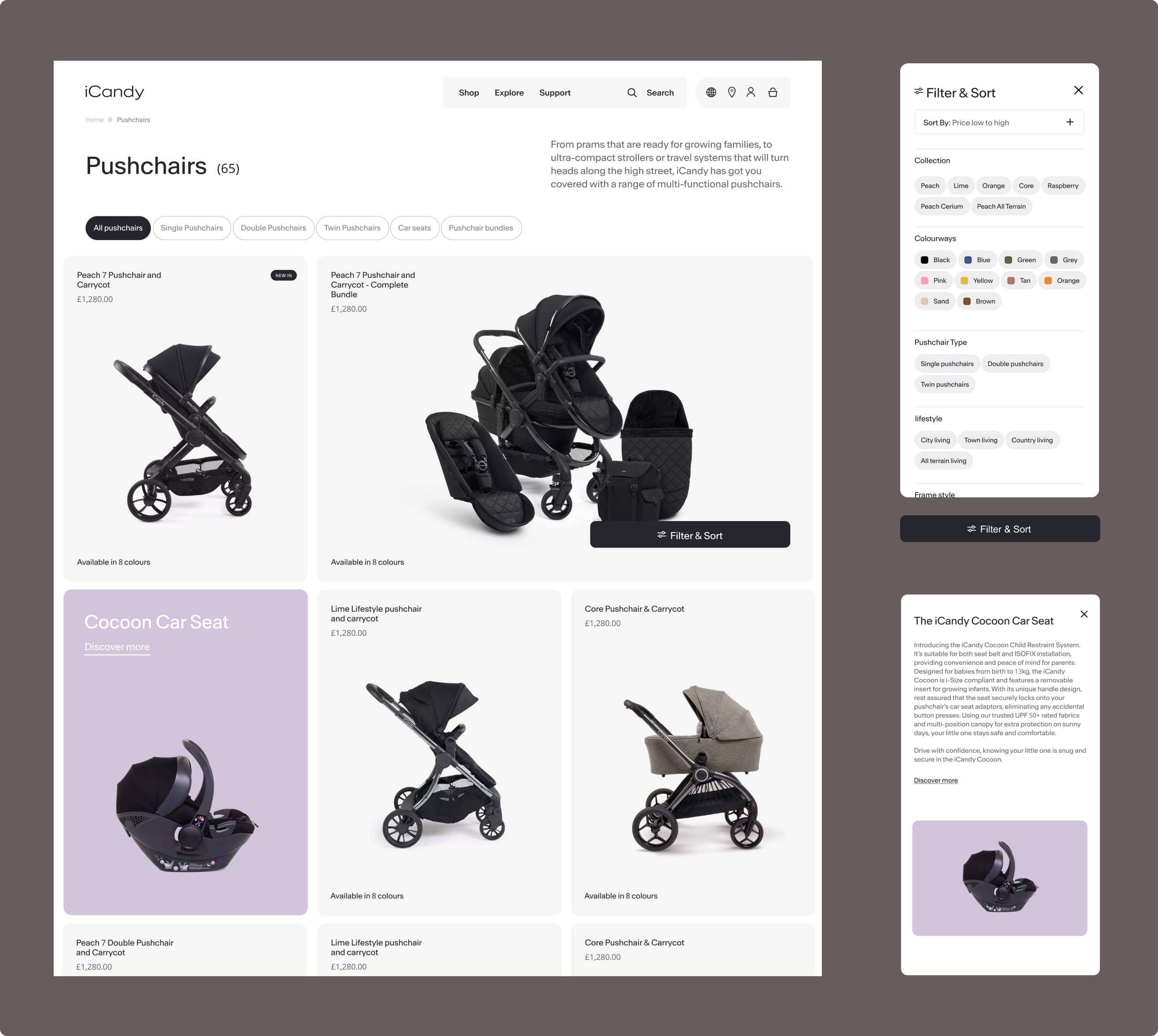
Redesigned product listing/category pages introduce improved filtering and sorting, with off-canvas pop-ups keeping customers engaged without breaking their flow.
Immersive product pages
Carousel galleries, rich imagery, and integrated videography elevate product storytelling, creating a more engaging customer journey.
Modular component system
iCandy’s team can update, merchandise, and scale content independently, ensuring consistency while reducing reliance on developers.
Streamlined checkout
A simplified checkout process, built with Shopify-native tools, reduces cart abandonment and increases conversions.
Client quote
“Unified were an absolute pleasure to work with. Their expertise made the transition from Magento to Shopify seamless, and they went above and beyond to support us throughout the process. They brought our vision to life and gave us complete confidence in our new platform."
Daniel Doogan - Digital Marketing Manager - iCandy


Impact
The migration to Shopify Plus transforms iCandy’s digital presence. The brand now operates on a scalable, high-performance platform that reduces maintenance costs, elevates the customer experience, and powers international growth.
Engagement has surged by 44%, actions per session increased by 82%, and checkout abandonment dropped by 15%. With a sleek, intuitive site and an empowered in-house team, iCandy continues to blend quality, innovation, and style for its growing global audience.


